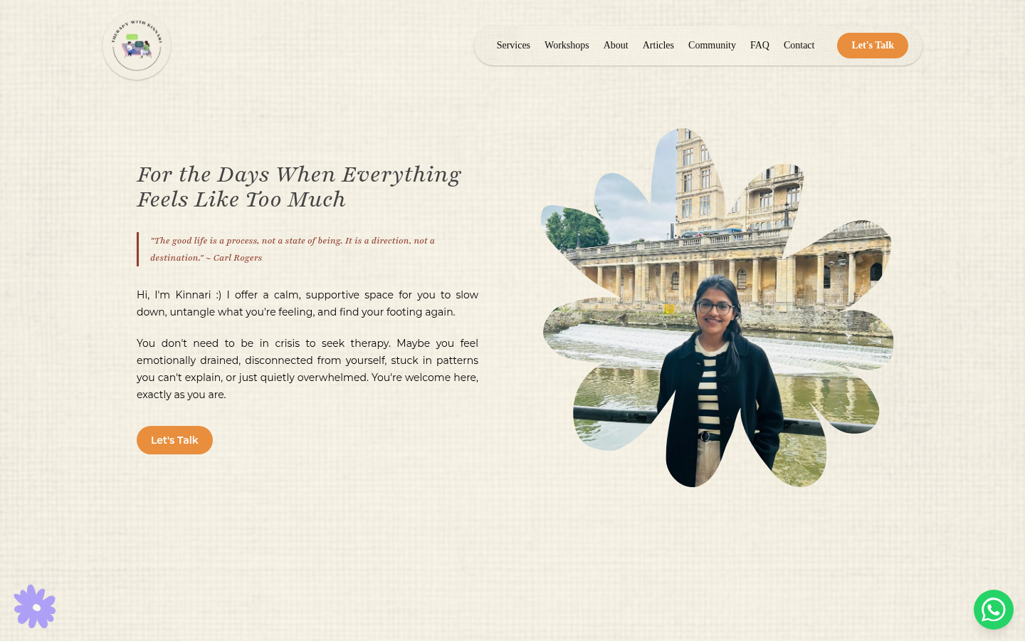
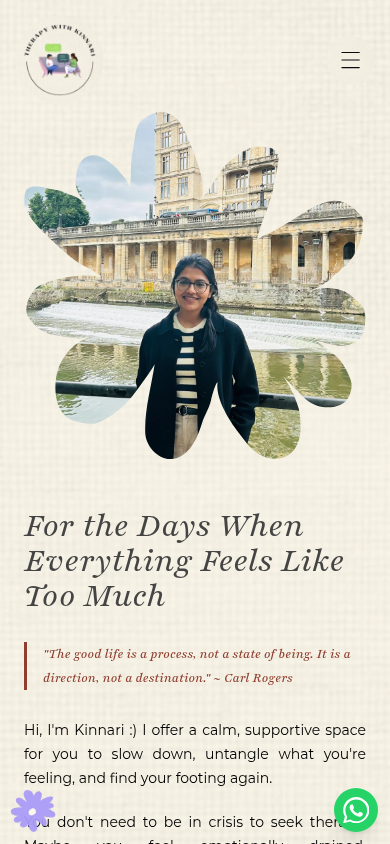
Therapy With Kinnari. For the days when everything feels like too much.
Overview
Therapy With Kinnari is the online home of a Mumbai psychologist's practice,
built to feel like the sessions themselves: unhurried and safe.
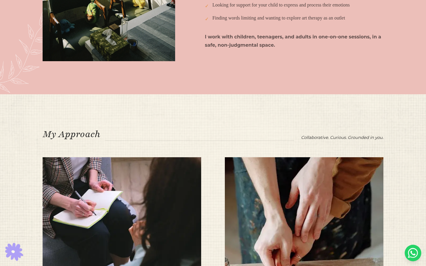
The practice offers talk therapy and art therapy, rooted in trauma-informed,
evidence-based approaches, for children, teenagers and adults in one-on-one
sessions. The site covers services, workshops, articles, a community space,
FAQs and booking.
The problem
The practice had a website, but it had effectively been lost. The domain had
been let expire, requested changes were going nowhere, and the Google
Business profile patients rely on to find and trust the practice was in a
mess. Online, the practice was hard to find and harder to reach, and none of
it was hers to fix: every change had to go through someone else.
So the brief was really two briefs. First, restore the basics: the domain,
the business presence, the ability to change things. Then build a site that
actually feels like Kinnari, on a subject where the wrong tone is a wall. A
therapy site can easily read like a clinic: sterile, credential-first, and
hard to take the first step from. For someone already overwhelmed, that tone
costs the practice the exact visitor it exists for.
Surface
Domain
Where the practice stood
Expired, with changes going nowhere
Where it stands now
Restored, and the practice’s own again
Surface
Google Business
Where the practice stood
In a mess, hurting discovery and trust
Where it stands now
Sorted out, so patients find the real practice
Surface
Making changes
Where the practice stood
Every edit waited on someone else
Where it stands now
Kinnari edits articles, workshops and FAQs herself in Sanity
Surface
First impression
Where the practice stood
Broken and clinical
Where it stands now
Calm, clean, and unmistakably hers
Surface
Where the practice stood
Where it stands now
Domain
Expired, with changes going nowhere
Restored, and the practice’s own again
Google Business
In a mess, hurting discovery and trust
Sorted out, so patients find the real practice
Making changes
Every edit waited on someone else
Kinnari edits articles, workshops and FAQs herself in Sanity
First impression
Broken and clinical
Calm, clean, and unmistakably hers
The visitors
The design brief I worked to was a person, not a market: someone arriving
sad, confused or unsure, on one of their harder days. From that starting
point, three arrivals the site has to hold at once.
The overwhelmed first-timer
One of their harder days
“Maybe talking to someone would help. I think.”
Arrives with
Low energy, less certainty, and a vague sense that talking to someone might help. Has never booked therapy.
The site owes
A page that meets the feeling first, explains without jargon, and keeps a way to reach out visible at every scroll depth.
The parent looking for a child
Worry, with a checklist
“Is this safe? What does a session even look like?”
Arrives with
Worry, and a practical checklist: is this safe, is it evidence-based, what does a session look like?
The site owes
Plain answers about approach, format, cost and confidentiality, stated before they have to ask.
The not-ready-yet reader
Curious, not committed
“I am not booking today. Maybe not this month.”
Arrives with
Curiosity without commitment. They will not book today, and maybe not this month.
The site owes
Somewhere to be: articles, resources and community that help without asking for anything back.
A reconstructed journey
Mapped from the live site's structure after launch: the distance between
landing on the page and reaching out, measured in moments of doubt.
100%
Between landing and reaching out sits a series of small doubts the design has to answer.
Layer
Actions
Lands on the homepage, mid-scroll within seconds
Reads what sessions look like and what they cost
Looks for proof this is safe: approach, FAQs, kind words
Picks a door: WhatsApp, a call, email, or Schedule A Session
Thoughts
Is this for someone like me?
Can I understand this without a psychology degree?
Will this be private? Can I trust her?
Which of these can I actually bring myself to do?
Emotions
Heavy, tentative
Cautiously curious
Testing for safety
Exposed, hopeful
Touchpoints
The opening line, the calm layout
Services, workshops, session formats
Approaches named plainly, FAQs, flower-name testimonials
A single high-pressure contact form as the only door
Opportunity
Several low-pressure doors, none locked behind a long form
Tap a stage to isolate it, zoom to read the whole map.
The landscape
Someone deciding to seek help does not compare this site to other
therapists' sites. They compare it to every easier thing they could do
instead, and to the cold versions of care they have already seen.
Sterile and credential-first. The first step feels like registering for a procedure.
Therapist directories
Choice, filters, reviews, price comparison
A wall of nearly identical profiles. The visitor does the matching work alone, on a hard day.
An Instagram-only presence
Warm, personal, familiar to scroll
No structure: no services, no answers on cost or confidentiality, and reaching out means a public-ish DM.
Where this site sits: personal like the Instagram page, structured like the
clinic portal, and judged entirely by one metric, how quickly an overwhelmed
visitor can reach out from any point on any page.
Role and constraints
I took on the recovery and the rebuild end to end: restored the domain,
sorted out the Google Business setup, then designed and built the new site
and the CMS behind it.
The design constraints shaped everything:
Picture the visitor honestly: someone arriving sad, confused or unsure, on
one of their harder days. The measure of every page is how quickly that
person can reach out.
The client is a practitioner, not a technical user. Once the site
launched, changing it could not mean calling a developer.
The subject is sensitive. Privacy is a design requirement, not a policy
page.
Warmth without haze. The site had to stay clean and uncluttered, with
concrete answers about cost, format and confidentiality never more than a
tap away.
Key decisions
Design for the overwhelmed visitor
Every page is judged by one question: how quickly can this person reach out
from here? That ruled out clever navigation, dense pages and anything that
makes a tired visitor work. It is also why the site is clean rather than
busy: clutter asks for attention this visitor does not have, so each screen
carries one idea and one next step.
Many touchpoints, each one low-pressure
People reach out in different ways, especially when reaching out is hard. So
the site keeps several doors open at all times, and no scroll depth leaves
the visitor without a way forward. The full map is in the touchpoints
section below.
Structure by state of mind, not org chart
The pages map to the ways someone actually arrives: what sessions look like,
what group formats exist, what to read if you are not ready to book, and the
practical worries people rarely ask out loud. Nobody has to understand the
practice to find their way around it.
Privacy in the details
Client kind words appear signed with flower names: Anemone, Marigold,
Dahlia. The site can show what sessions mean to people without ever exposing
who they are. For a therapy practice, that choice is the brand.
A calmer voice
For the days when everything feels like too much.
The homepage leads with how the visitor feels, not with the therapist's
qualifications. A Carl Rogers line, "the good life is a process, not a state
of being", sets the frame, and Kinnari introduces herself with "you're
welcome here, exactly as you are."
That voice carries through the whole site: therapy is described as
"understanding you, not fixing you", with talk and art as two doors into the
same room. Approaches like CBT, DBT, mindfulness and person-centered therapy
are named plainly, as reassurance rather than jargon.
01
Leads with the feeling
The first line meets the visitor’s day, not the therapist’s credential list. Qualifications are easy to find, but they are not the welcome.
02
Help within one tap
A way to reach out stays visible at every scroll depth, so no moment of reading strands someone without a way forward.
03
One idea per screen
The spacing is the feature. Nothing competes for attention a tired visitor does not have.
The tokens behind the calm
A serif for warmth, a sans for clarity, and a palette that stays quiet. The
actual values the site ships with:
Terracotta#8F3E2EThe one accent: borders, highlights, quiet emphasis
Cream#EDE9DFWarm section backgrounds instead of clinical white
Ink#171717Text, soft black
WhatsApp#25D366The floating reach-out button
AaPlayfair DisplayPlayfair DisplayHeadings: the warm, editorial voice
AaMontserratMontserratBody: plain and easy to read on a hard day
The structure
Services describe what sessions look like, Workshops cover the group
formats, Articles and Community give people who are not ready to book
somewhere to be, and an FAQ answers the practical worries, cost, format,
confidentiality, that usually go unasked.
Sections are written for the visitor's state of mind, not the business's org chart.
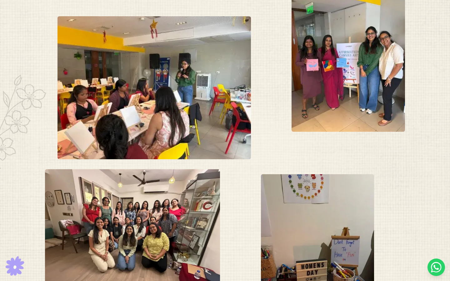
The art-based workshops carry the practice into workplaces: guided creative
sessions for teams, offered in the same unhurried tone as the practice
itself.
Workshops carry the practice into workplaces: a pause, not a procedure.
The touchpoints
Reaching out is the conversion this site exists for, and it is also the
hardest thing it asks. So there is never one door, and none of them is
locked behind a long form.
Touchpoint
Let’s Talk, on every page
Who it is for
The visitor who needs the invitation phrased gently
Design intent
A standing, low-pressure invitation rather than a "contact us" command.
Touchpoint
Floating WhatsApp button
Who it is for
The visitor who would rather type than talk
Design intent
Follows the scroll, so no depth of reading ever strands someone without a way forward.
Touchpoint
Plain contact details
Who it is for
The visitor who wants a phone number or an email address, plainly
Design intent
No form between them and a direct line. Some people trust what they can save.
Touchpoint
Schedule A Session
Who it is for
The visitor who is ready now
Design intent
One calm step, in person in Mulund West or from home, phrased as "choose what feels right for you."
Touchpoint
Who it is for
Design intent
Let’s Talk, on every page
The visitor who needs the invitation phrased gently
A standing, low-pressure invitation rather than a "contact us" command.
Floating WhatsApp button
The visitor who would rather type than talk
Follows the scroll, so no depth of reading ever strands someone without a way forward.
Plain contact details
The visitor who wants a phone number or an email address, plainly
No form between them and a direct line. Some people trust what they can save.
Schedule A Session
The visitor who is ready now
One calm step, in person in Mulund West or from home, phrased as "choose what feels right for you."
Booking without friction
Booking a session is one calm step, not a form gauntlet. Sessions work in
person in Mulund West, Mumbai, or from the comfort of home, and the site
says so in the visitor's own terms: "choose what feels right for you." The
moment someone decides to reach out is the moment the site should get out of
the way.
100%
The moment someone reaches out
Lands on any page
Every page is a landing page for this visitor, so every page carries the same calm and the same open doors.
Next: Reads at her own pace
Reads at her own pace
One idea per screen. Services, workshops, FAQs and articles answer the questions people rarely ask out loud.
Next: Ready to reach out? · Sanity CMS
Ready to reach out?
The only decision the site asks for. Nothing else pushes; the reading itself is allowed to be the visit.
Next: Yes: Picks a low-pressure door · Not yet: Keeps reading
Picks a low-pressure door
Let's Talk, the floating WhatsApp button, plain contact details or Schedule A Session. None locked behind a long form.
Next: Conversation starts
Conversation starts
The site gets out of the way. What happens after belongs to the practice.
Keeps reading
Not ready is a valid outcome: articles, resources and community help without asking for anything back.
Next: Reads at her own pace
Sanity CMS
Kinnari edits articles, workshops and FAQs herself, so the answers stay current without a developer.
Scroll across the diagram and tap a step to read what it does. Use + or − to zoom.
Several doors, none of them locked behind a form.
Tradeoffs and limits
Decision
Feeling first, credentials later
Why
The overwhelmed visitor bounces off resume-style openings
What it costs
A skeptical visitor has to scroll further to verify qualifications.
Decision
Many light doors over one strong funnel
Why
People reach out in different ways when reaching out is hard
What it costs
No single measurable funnel; enquiries arrive scattered across channels.
Decision
Anonymized testimonials
Why
Privacy is the brand for a therapy practice
What it costs
Flower names carry less conventional social proof than full names and photos.
Decision
A CMS for a non-technical owner
Why
Changing the site could not mean calling a developer
What it costs
The editing surface is simpler than a developer’s toolchain by design.
Decision
Why
What it costs
Feeling first, credentials later
The overwhelmed visitor bounces off resume-style openings
A skeptical visitor has to scroll further to verify qualifications.
Many light doors over one strong funnel
People reach out in different ways when reaching out is hard
No single measurable funnel; enquiries arrive scattered across channels.
Anonymized testimonials
Privacy is the brand for a therapy practice
Flower names carry less conventional social proof than full names and photos.
A CMS for a non-technical owner
Changing the site could not mean calling a developer
The editing surface is simpler than a developer’s toolchain by design.
The limit worth naming: a website can shrink the first step, but it cannot
take it. The design gets a visitor to the door; the practice earns what
happens after.
Outcome
The practice is back online on its own domain, with its Google Business
presence restored and a site that finally feels like Kinnari. It runs on
Next.js with Sanity behind it, so articles, workshops and FAQs are hers to
change. A therapist's site is a living thing: new groups, new writing, new
answers. None of that needs a developer anymore.
The result is warm where the practice's old presence was broken and
clinical, and structured around the visitor's first step.
No visitor interviews or conversion numbers are claimed here; the outcome
stated is the one that visibly shipped.
Takeaway
Design here is mostly tone. The palette, the spacing and the copy all answer
the same question: does this make the first step smaller?