Live storeHeadless ShopifySelf-hostedCash on deliveryPostHog A/B tests
Actually Fair. Transparent pricing on every product, no, for real.
Overview
Actually Fair is a shopping site built around one idea: the price you see
should make sense.
The store sells across athleisure, backpacks and travel gear, sunglasses,
jewelry, electronics, and skincare and grooming. It runs as a live,
self-hosted storefront with real payments, real inventory and cash on
delivery, and it is selling today.
Revenue growth
Monthly, in this period, with a significant Meta ads push alongside
~8
Self-hosted services in the stack behind the storefront
6
Product categories on one calm catalog
The problem
Online stores often keep pricing and sourcing opaque. Reference prices are
inflated, the sale never ends, and the shopper has no way to tell what
anything should actually cost.
Actually Fair's bet is that a store can win on the opposite: show fair
pricing plainly, on every product, and let that be the brand. The catch is
that this turns pricing into a design problem. If the math is legible on one
page and hidden on the next, the promise collapses.
There was a craft problem alongside the business one. The store ran on a
stock Shopify theme, and the theme could no longer give the design the
control the brand needed.
The shoppers
These are the three people I designed for, reconstructed from the catalog
and how the store sells. Every layout decision was checked against one of
them.
The deal skeptic
Burned by staged sales
“Every discount is staged until the math says otherwise.”
Arrives with
Years of inflated MRPs and permanent sales on Indian ecommerce.
The store owes
The math on the card, before any product page: selling price, reference price and percentage off in one glance.
The mobile impulse buyer
One thumb, two minutes
“If the price needs a second tap, I am gone.”
Arrives with
A link from an ad, two minutes of attention, one thumb.
The store owes
A fast page, a legible price, and cash on delivery with no account gymnastics.
The returning member
Account, orders, a wish list
“Let me ask for what you do not stock yet.”
Arrives with
An account, past orders, and a wish list of things the catalog does not carry yet.
The store owes
A members area that remembers them, and a way to ask for products instead of silently leaving.
A reconstructed journey
The path the design optimizes for, mapped from the live store's flows. Its
job is to keep every screen honest about what the shopper is feeling at that
step.
100%
Every step is a chance for the pricing promise to break.
Layer
Actions
Lands from an ad or search on a category or product
Compares selling price, reference price and photos
Adds to cart, picks COD or online payment
Tracks the order, browses what is new
Thoughts
Is this another fake-sale store?
What should this actually cost?
Will checkout waste my time?
Did I get what the page promised?
Emotions
Guarded
Comparing
Impatient
Judging the promise
Touchpoints
Category grid, price badges
Product page, reviews, pricing block
Cart, members area, COD checkout
Order updates, Make A Wish, new arrivals
Pain
Grids that hide the real price until the click
Reference prices that cannot be believed
Forced accounts and surprise charges
No way to ask for what is missing
Opportunity
Discount math on every card, before any click
Same math repeated in the same shape
Familiar Indian checkout patterns, COD first
Wish requests turn dead ends into a conversation
Stage 1
Discovers
Actions
Lands from an ad or search on a category or product
Thoughts
Is this another fake-sale store?
Emotions
Guarded
Touchpoints
Category grid, price badges
Pain
Grids that hide the real price until the click
Opportunity
Discount math on every card, before any click
Stage 2
Evaluates
Actions
Compares selling price, reference price and photos
Thoughts
What should this actually cost?
Emotions
Comparing
Touchpoints
Product page, reviews, pricing block
Pain
Reference prices that cannot be believed
Opportunity
Same math repeated in the same shape
Stage 3
Buys
Actions
Adds to cart, picks COD or online payment
Thoughts
Will checkout waste my time?
Emotions
Impatient
Touchpoints
Cart, members area, COD checkout
Pain
Forced accounts and surprise charges
Opportunity
Familiar Indian checkout patterns, COD first
Stage 4
After the order
Actions
Tracks the order, browses what is new
Thoughts
Did I get what the page promised?
Emotions
Judging the promise
Touchpoints
Order updates, Make A Wish, new arrivals
Pain
No way to ask for what is missing
Opportunity
Wish requests turn dead ends into a conversation
Tap a stage to isolate it, zoom to read the whole map.
The landscape
The shopper's alternatives are not other boutique stores. They are the
default ways India buys online, and each one trains a habit the store has to
answer.
Alternative
Large marketplaces
Real strength
Infinite selection, fast delivery, prices everyone checks first
Where it leaves this shopper
Opaque reference pricing and a scroll of near-identical listings. Nobody is accountable for what a thing should cost.
Alternative
Typical D2C theme stores
Real strength
Cheap to launch, familiar Shopify patterns
Where it leaves this shopper
A stock theme with a sale banner. The brand promise stops at the homepage hero.
Alternative
Social commerce and resellers
Real strength
Personal, conversational, low friction to ask questions
Where it leaves this shopper
No catalog, no price list, no record. Trust lives entirely in the chat.
Alternative
Real strength
Where it leaves this shopper
Large marketplaces
Infinite selection, fast delivery, prices everyone checks first
Opaque reference pricing and a scroll of near-identical listings. Nobody is accountable for what a thing should cost.
Typical D2C theme stores
Cheap to launch, familiar Shopify patterns
A stock theme with a sale banner. The brand promise stops at the homepage hero.
Social commerce and resellers
Personal, conversational, low friction to ask questions
No catalog, no price list, no record. Trust lives entirely in the chat.
Where Actually Fair sits: the catalog discipline of a marketplace, the
accountability of a store that puts its own name on the pricing, and none of
the noise. The brand wins only if the math survives every screen, which is a
harder design brief than looking premium.
Role and constraints
I worked on the store as technical lead, end to end: the storefront, the
backend services and the internal tooling the team works in.
The work shipped against real constraints:
A live store. Changes went out against real orders and real inventory, not
a staging playground.
A self-hosted budget. The stack had to stay cheap to run, so it is built
from parts the store owns rather than rented platforms.
Shoppers trained by Indian ecommerce. Cash on delivery, a members area and
familiar cart patterns are expectations, not features.
Key decisions
Headless over a theme
The store moved off the stock Shopify theme to a headless Next.js and
Tailwind build. Shopify still owns products, cart and checkout; everything
the shopper sees is ours to design. The tradeoff is real, a theme is free
and headless is work, but the brand lives in the details of how prices and
products are presented, and those details were exactly what the theme would
not give up.
Transparency as a component rule
Fair pricing is enforced at the component level, not the copy level. Every
product card shows the selling price next to the reference price with the
percentage off, and the product page and cart repeat the same math in the
same shape. It is a rule about what components must render, which is the
only way a promise survives every screen.
Own the services where Shopify stops
Whatever Shopify does not cover became a small service we own, self-hosted
on Railway: a reviews service so social proof lives in the store's own
database, an order-ingestion webhook service that keeps internal tooling in
sync as orders land, and a custom CMS, because Sanity was not a fit for this
team's workload. Owning the services changes what features cost: something
like Make A Wish, where shoppers ask for a product the catalog does not
carry yet, is a small build inside our own stack instead of a plugin hunt.
It turns a gap in inventory into a conversation, and every request is a
signal about what to stock next.
The storefront
The catalog is wide, so the browsing has to stay calm. Categories sit in a
predictable order, each with its own landing view: athleisure, backpacks and
travel, sunglasses, jewelry, electronics, and skincare, with new arrivals
surfaced per category. No department is more than one tap away, and no page
asks the shopper to hunt.
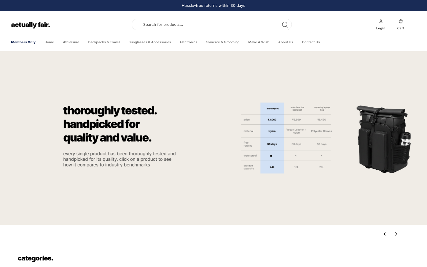
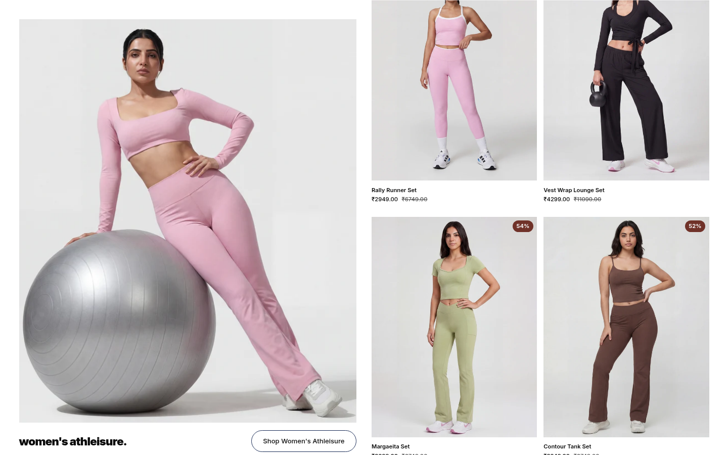
A category landing view: flat layout, product cards, and the pricing math already on the card.
Best sellers carry the discount math on the card itself, so the deal is
legible before a single product page opens. The grid does the selling; the
product page only has to confirm it.
The tokens behind it
The visual system is deliberately quiet: one warm paper, real blacks, one
navy, and a single typeface doing all the work. These are the actual values
the store ships with.
Paper#F0ECE6The warm hero background the catalog sits on
Inkoklch(14.5% 0 0)Text: near-black, never a tinted gray
Brand navy#243F78Accents and trust elements
WhatsApp#25D366The order conversation, one tap away
AaInterInterInter Variable on the store; weight and size do the hierarchy
Pricing in the open
transparent pricing on every product. no, for real.
That line is the store's whole pitch, and the design treats it as a contract
rather than a slogan. The percentage off sits on the card as a badge, the
reference price sits next to the selling price, and the shopper never has to
take the deal on faith.
01
The math on the card
Selling price, reference price and percentage off are visible before a single product page opens. The deal is never a mystery.
02
The same shape everywhere
The grid, the product page and the cart repeat the pricing block in the same shape, so the promise cannot drift between screens.
03
Calm grid, no noise
No countdown timers, no fake urgency. The discount stands on its own, which is what makes it believable.
The same rule holds in the cart. The shopper never has to wonder whether the
price changed between the grid and the checkout, because it is the same
number, presented the same way, the whole way through.
Cart and checkout
The cart and login flows follow familiar Indian ecommerce patterns: a
persistent cart, a members area, and cash on delivery at checkout. Nothing
about paying asks the shopper to learn a new pattern, which matters for a
young brand that has no trust surplus to spend.
Browse a category→Read the math on the card→Open the product→Add to cart→COD or online payment→Order confirmed
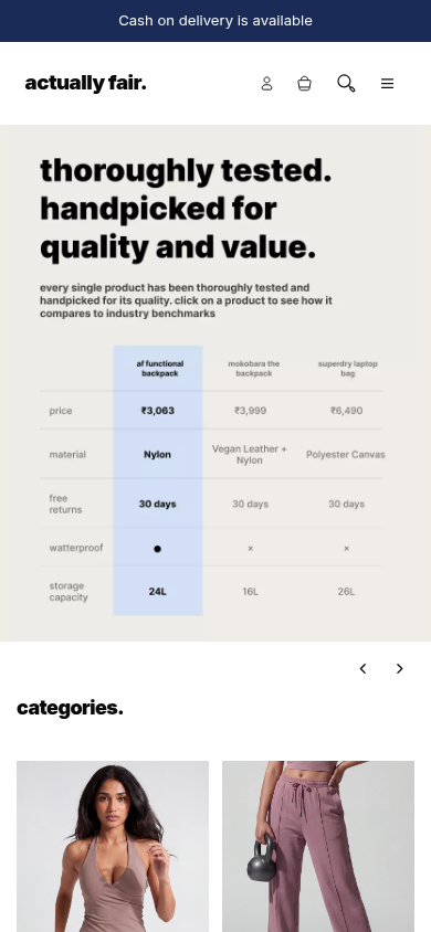
The storefront on a phone, with the same pricing math in view on a small screen.
Testing and iteration
The storefront is refined against evidence, not taste alone. PostHog A/B
tests run against the live store, and the results guide what ships, with
particular attention to the mobile experience. The loop is simple: change
one surface, watch what shoppers do, keep what earns itself.
Mobile gets the attention because that is where the shoppers are. Layout,
tap targets, load order and the placement of the pricing math were all tuned
through these passes until the small screen stopped being the compromised
version of the store.
Under the hood
The operational moment this stack lives for is the minute an order lands:
nobody exports anything, nobody copies anything, and the store's own tooling
already knows.
100%
The minute an order lands
Order placed
A shopper checks out on the storefront, COD or online payment. From here on, nobody exports or copies anything by hand.
Next: Shopify fires a webhook
Shopify fires a webhook
Headless Shopify owns products, cart and checkout, and announces every order event the moment it happens.
Next: Ingestion service catches it
Ingestion service catches it
The order-ingestion service, one of the custom services I built, catches every event as it lands.
Next: Internal tooling in sync · Custom services on Railway
Internal tooling in sync
The tooling the team works in reflects the order immediately. No CSV exports at night.
Next: Team acts on live data
Team acts on live data
Fulfillment and merchandising decisions run on what the store is doing right now.
Next.js storefront
Everything the shopper sees is ours to design; Shopify stays the engine underneath.
Next: Headless Shopify
Headless Shopify
Products, cart and checkout. The one rented piece, kept where it is strongest.
Custom services on Railway
Reviews, order ingestion, the custom CMS and Make A Wish: small services the store owns, self-hosted on Railway.
Scroll across the diagram and tap a step to read what it does. Use + or − to zoom.
The storefront, the one rented engine, and the services the store owns.
The storefront is Next.js and Tailwind talking to headless Shopify for
products, cart and checkout. Around that core, the stack runs about eight
services, self-hosted on Railway. The custom ones I built cover reviews,
order ingestion, the custom CMS and the rest of what the store needs beyond
Shopify.
Service
Reviews service
Job
Stores and serves product reviews
Why it is ours
Social proof lives in the store’s own database, not rented from a review platform that can change terms or hold the data.
Service
Order-ingestion webhooks
Job
Catches every order event as it lands
Why it is ours
Internal tooling stays in sync with the store in real time, without anyone exporting CSVs at night.
Service
Custom CMS
Job
Content and merchandising for the team
Why it is ours
Built for this team’s workload: Sanity was too slow at the order volume they process, so the CMS is shaped around their day, not a generic editor.
Service
Make A Wish
Job
Shoppers request products the catalog lacks
Why it is ours
A small build inside our own stack, where a plugin would have meant bending the storefront around someone else’s data model.
Service
Job
Why it is ours
Reviews service
Stores and serves product reviews
Social proof lives in the store’s own database, not rented from a review platform that can change terms or hold the data.
Order-ingestion webhooks
Catches every order event as it lands
Internal tooling stays in sync with the store in real time, without anyone exporting CSVs at night.
Custom CMS
Content and merchandising for the team
Built for this team’s workload: Sanity was too slow at the order volume they process, so the CMS is shaped around their day, not a generic editor.
Make A Wish
Shoppers request products the catalog lacks
A small build inside our own stack, where a plugin would have meant bending the storefront around someone else’s data model.
Tradeoffs and limits
Decision
Headless over a stock theme
Why
Full design control over how pricing and products are presented
What it costs
A theme is free; headless is ongoing engineering. Every Shopify update is ours to absorb.
Decision
Own microservices over apps
Why
Features like reviews and wish requests fit the store exactly
What it costs
We run and watch about eight services. The operational bill is ours.
Decision
Custom CMS over Sanity
Why
Sanity was too slow for this team’s order volume and workflow
What it costs
We maintain the editing surface ourselves instead of renting a mature one.
Decision
COD and familiar patterns
Why
A young brand has no trust surplus to spend on novel checkout
What it costs
Cash on delivery carries its own logistics and return realities for the business.
Decision
Why
What it costs
Headless over a stock theme
Full design control over how pricing and products are presented
A theme is free; headless is ongoing engineering. Every Shopify update is ours to absorb.
Own microservices over apps
Features like reviews and wish requests fit the store exactly
We run and watch about eight services. The operational bill is ours.
Custom CMS over Sanity
Sanity was too slow for this team’s order volume and workflow
We maintain the editing surface ourselves instead of renting a mature one.
COD and familiar patterns
A young brand has no trust surplus to spend on novel checkout
Cash on delivery carries its own logistics and return realities for the business.
The limit worth naming: the storefront can make pricing legible, but it
cannot make pricing fair. That part is the business keeping the promise the
components repeat.
Outcome
A live headless Shopify storefront with clear product pages and calm flows,
across six product categories, with cash on delivery, a members area and a
wish-request channel. Under it, a set of custom services and internal tools
that the store runs on every day.
Over the period this work was shipping, the store's monthly revenue grew,
with a significant Meta ads push driving much of it alongside the site
itself. The storefront and the services behind it carried their share.
Exact revenue figures stay private at the store's request.
Takeaway
The interesting constraint was that "fair" is a design requirement, not a
marketing one. Every surface, from the product card to the checkout, has to
hold the same promise or the brand falls apart. Most of the work was not
making the claim louder, but making it survive contact with every screen.